Showing posts with label interior design. Show all posts

Wednesday, April 27, 2011

dining table love

I was looking online at World Market and came across some dining tables that I love.  Let me share...

This green color is what does it for me.  Fabulous.  This would look great in a little kitchen knook nook {thanks sarah}!


This is a great industrial look.  Crate & Barrel has some metal chairs that I have been swooning over and these fall into that category as well.  The simplicity of the wood table top is great.
While living in Dallas I drooled over this table everytime I went into a World Market.  It's hard to see in this photo, but the wood has a great "distressed" quality about it.  Nice to know it's still around!
I love that they have great looking furniture, made out of great materials, at an affordable price.  Now THAT is right up my alley!

World Market is one of those stores that has so many wonderful things.  These tables are just the tip of the iceberg, but I felt that I needed to share.  This weekend I will be in Dallas and will definitely be making a pit stop at World Market.  And I know I won't leave without a few packages of these....


Tim Tams.  I was introduced to these when i was in australia.  When i got home from australia i ordered these from Australia.  And then i found them at world market.  Oh yes.  And occasionally they will actually have them at Target as well.  I highly suggest you try them {not sure about the mint slice in the pic....never had those...but the original and chewy caramel are great}!


Monday, April 18, 2011

pleasantly surprised

today i was furniture shopping for some clients and i ventured into mathis brothers.  usually i don't go b/c most of their product is so traditional and you get mobbed by the sales team as soon as you enter.  but, with tulsa being limited in the furniture store department, i decided that it was a must.

and i must report that i was pleasantly surprised with what i found.  once you get passed the marshmallow couches {you know the ones i'm talking about....roll after roll of upholstery} and make your way towards the back, you will find some really neat pieces.  their bernhardt and sam moore lines were my favorites.  here are a few that i really love...


love the armless/angled arms on these two bernhardt chairs.  it's a modern, clean take on the traditional arm chair.


love the button tufting on these two sam moore chairs.  also, the unique shape on the grey one lends itself to so many interesting settings!  check out that fabric on the second one....very season appropriate if i do say so myself!  beautiful with the pink and green colors.

this is just a teensy sampling of the neat furniture i found today at mathis.  i have to say that i am glad they have more options that aren't so fluffy and overstuffed! 


Friday, March 18, 2011

i'm jealous of your....

patio or porch, that is if you have one.  these past couple of beautiful days have me itching for a covered patio.  i love being able to lounge outside!  if i ever have one, i will want an outdoor fireplace at one end.  i want it to be deep so you can sit outside when it's raining and not get wet.  i want comfortable lounge seating and a really long table for fabulous meals cooked in the outdoor kitchen.  i want, i want, i want.....a girl can dream, right? 

well, to get you dreaming, i have posted some photos that i found on decorpad {super cool interiors website...great for getting inspiration!}.


in this next photo, the kitchen opens up to a patio....LOVE!


do you have a great patio or porch area?  if so, please share...you can email photos to rubyjewelstudio@gmail.com.  if i get some pics, i'll be sure and share!

and for those of you that do have a fabulous patio/porch area....embrace outdoor living!

happy friday!


{all photos were found at decorpad}

Friday, March 4, 2011

bookcases....how the heck to decorate them

i hear people stress about decorating bookcases alot.  it can be daunting.....6 shelves, 10 feet tall....how the heck do i fill the space?  bookcases are a great place to showcase family treasures, travel souveniers, and all the many books that you collect over the years.  i have scoured the internet to find some great examples of things you can do.  i wish i had bookcases in my house b/c of all the unique ways you can decorate them.  so, kick back and take a look at how a huge, plain jane bookcase can become one of your favorite areas of your house!


books - they don't HAVE to stand straight up and they don't all have to go the same way.  lay some on their sides and stack them tall

i love how the picture frame is attached to the front of the bookcase.  who says a frame has to hang on a wall?

notice how the back of the bookcase is painted yellow?  this is a great place to add pops of color without it being overwhelming.  and so easy to change.


this is one of my favorites...organizing your books and magazines according to their spine colors.  i love this.  unfortunately i don't have quite enough to do this, but i'm well on my way, thanks to book club!  if you check out the "hooked on houses" link, be sure and read about the book store that arranged ALL of their books by color.  super cool!  not sure how easy it would be to find the book you need, but at least you would have something beautiful to look at while searching! 


turn a bookcase or cabinet into a bar area/wine cabinet.  i hope to have some pics of one of my client's projects soon.  we did something similar with a large china cabinet in her dining room {no pressure sarah!}.  you can purchase racks that you screw into the bottom of a shelf for glasses to hang.  pick up wine racks for bottles and use beautiful decanters to turn a simple bookcase or cabinet into a useable bar area.


another favorite of mine...use wall paper on the back of a bookcase to add fabulous pattern and color.  think about some of the wallcoverings from this past ruby jewel post.  what a statement!  and let's talk about that second photo....the "bookcase" is made out of cabinet drawers.  so very creative.

in almost all of these photos you will see that they have combined books with knick knacks and photos to create a space that is interesting to look at.  hopefully this gives you some inspiration for some of those blank bookcases and cabinets in your home.

if you have done something unique to a bookcase, email me a pic!  i would love to see it.  rubyjewelstudio@gmail.com

happy weekend!!!


Friday, February 18, 2011

an addition to a library

on monday, i got the chance to walk through one of my projects that is just finishing up.  the scope of the project was to add on to the existing middle school library and re-layout the offices.  i was very happy with the end result.  here are some before & after pics.....

BEFORE

AFTER

in the after photo below, i was standing in the existing library.  we puched through the existing window {that has the red curtains in the before photo and in the after photo the opening is between the yellow and green column} and added on a space that doubled the existing library.


BEFORE

BEFORE


AFTER

this photo is looking into the new library addition.  we added huge windows that look out over the country side where you can see the beautiful mountains.  this space will soon serve as a computer lab with tables and computers.

AFTER

i was able to design a custom circulation desk that accomodates up to two computers and it also has a book return slot.  the circulation desk is located in the center of the library so that the librarian can easily observe the entire library.

for this space i chose to use 5 different carpet tiles that are repeated throughout the space in different width stripes.  4 of the carpet tiles are made up of the same colors, but simply have different patterns.  the fifth carpet tile is the red which serves as an accent color and is the school's color.  since this space was deeper than it was wide, the horizontal stripes really help break up the space.

AFTER

below is one of their old circulation desks

BEFORE

by making the circulation desk have taller "walls" you can hide a lot of clutter.

AFTER

BEFORE


AFTER


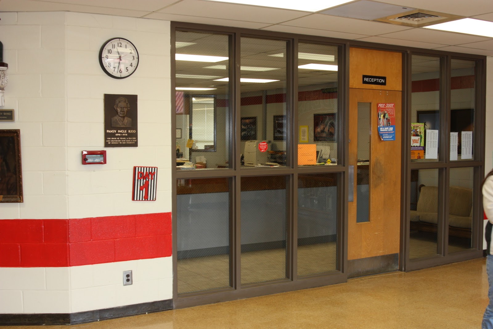
this is the reception area in the school office.  we were able to give them built-in desks instead of random desks that were collected over the past 30 years.

BEFORE


AFTER

this was their *lovely* before flooring....

BEFORE

a little bit of a difference!

AFTER

this is a perfect project that shows how an old, out-of-date space can be revived.  unfortunately i don't have before photos to share.....boo on me! i found before photos!  yay!

enjoy the beautiful weather this weekend!!!


Friday, January 28, 2011

design highlight....take 5

the miller's home

i was lucky enough to help out one of my good friends, carissa with c.c. miller photography, with her new home.  this was a great project...and a fast project!  if i remeber correctly, they broke ground in march and the house was in the tulsa parade of homes in june!  crazy fast!

for this project i was able to help out from the very beginning.  i designed most of the millwork {cabinets}, selected all the finishes {flooring, counters, backsplash, color palette, wallcovering, carpet}, selected lighting fixtures, helped select the hearth room dining table, and was on site quite a bit as the project was under construction.  i love being apart of projects like this because you get to start from the ground and work your way up.

as you will see, the color palette for this home is simple, yet very inviting.  we chose 3 colors total to use throughout the entire house.  the main color is a light grey/blue, the main accent color is a darker blue/grey, and the third accent color is a soft brown {not shown in any photos}.  these paint colors are paired with dark pine wood floors, tile floors that resemble slate, and also white & espresso cabinetry.  by selecting colors, materials, and finishes that flow throughout the house, you create a home that is cohesive and makes sense from one room to another.

on to the photos...i will explain more as we go through the house.

this is the entry.  wonderful, tall ceilings with beautiful white moldings.  the entry is in the main accent color, the darker grey/blue.  on either side of the entry i designed display areas.  the lighted arches accent the vinly wallcovering and high wainscoting.  the high wainscoting is the perfect place for the family to display photos.


an upclose of the vinyl wall covering.  that's right people, it's wall paper and it's gorgeous!  it's actually not wall paper.  it is vinyl and super durable.  this particular wallcovering is a light silver color with and organic leaf pattern.  it has a slight shimmer to it, which is accentuated even more by the recessed lighting in the arches.  this photo also shows the photo ledge at the top of the tall wainscoting.  you don't need much room at all for simple frames and canvases to rest.


this is a view from the entry into the main living room.  this  room is the main overall paint color, light grey /blue.  here you can see the combination of the rustic wood floors and beams, with the ornate white moldings.  i love the combination...not too fancy and not too rustic.


as i mentioned before, for this project i was able to help with the designing of the client's millwork.  carissa had done lots of research on different things that she liked for the kitchen.  she loves to cook, so having the perfect kitchen was high on her list.  i asked her to find inspiration photos so that i could get an idea of her likes.  this is the elevation, that i drew, of the back kitchen wall.
as you can see it turned out pretty darn close to the drawings!


another area that was important to carissa was their "hearth room".  they didn't want a typical formal dining room.  instead she wanted a space where the family could join together and feel relaxed and comfortable.  she had always wanted a window seat with a big table.  i designed the main focal wall of the hearth room to include storage space with open shelving and closed cabinets and in the center, under the picture window, a built in window seat.  this window seat serves as seating for one whole side of their, huge, beautiful table.  on the left you will see the elevation and on the right you will see the section drawing, showing how to construct the window seat.
carissa and i got a little bit of resistence from some of the guys on this idea.  not necessarilly b/c they didn't think it would look good, but because it wasn't "typical".  the millwork guy had noever done anything like this before.  i distictly remember her calling me saying that i needed to come down and talk to the millwork guy b/c he didn't think it was going to work.  she was like, "i can't give up on this now!"  so, after talking with the sub, measuring out the lines and drawing them on the concrete with my finger in the saw dust, he finally agreed to it and set to work.  i absolutely love how it turned out.  he was an awesome sub.  

this photo also shows the great lantern light fixtures, another photo inspiration from carissa.  also, this hearth room goes back to the darker accent color. 


a closer look at the built in window seat...


for the kitchen backsplash we chose a beautiful glass tile.  LOVE it!  i'm telling you...glass tile is where it is at!  it adds so much dimension and character to a space.


many of the inspiration photos that carissa found showed marble counter tops in the kitchen.  yes, they are beautiful, NO they are not practical.  they will stain...ketchup...red wine....not good.  i would hate for anyone to spend money on beautiful marble, only for it to get stained down the road.  i was able to find a granite that was light and had grey...this was a great substitute for the original idea of marble.  it turned out beautiful, and it even has a few small specs of red.


love the lights over the kitchen island.  so simple, yet they make such a great statement!


this photo shows the combination of the main paint color and the main accent color, beautiful wood stairs, and a darker colored carpet. 


on to the bathrooms.  you will notice that the millwork in the bathrooms changes to the dark espresso color.  the flooring is a porcelain tile that looks like slate.  i love this tile b/c it is so natural looking and great warm colors.  no two tiles are alike, so you get great variety in each room.  we carried the same granite throughout all the bathrooms, which looks great with the bright white vessel sinks.  the backsplash in the bathrooms is another glass mosaic tile. 


below is the master bath.  same dark espresso millwork.  you will notice that we did the whole length of the wall with a mirror and mounted tall, linear fixtures ontop of the mirror.  this provides great reflection within the bathroom.


color pop!


wow!  this was a super long post!  thanks for hanging in there.  i had a blast working on this home project and love the way it turned out.  i joked about mymichael and i living in a small portion of it.  i really don't think they would mind! =)

i hope you all enjoyed all the design highlights this week.  i am getting oh so close to having all the details worked out on my new firm, ruby jewel studio.  i will be offering residential and contract commercial interior design services.  they will range from something as simple as paint color selection to a project like the miller's, so there will be something for everyone!  keep me in mind for any of your design needs.

happy friday!!!
Related Posts Plugin for WordPress, Blogger...